Laura Jordan Bambach’s Top 10 Ads of All Time
For the last few months, we’ve showcased the Top Ten Ads of All Time as selected by some of the brightest luminaries in adland.
So far, we’ve had Sir John Hegarty, Rory Sutherland and Emma de la Fosse, and now it’s Laura Jordan Bambach’s turn.
Laura was an experimental artist in Australia and came to Britain to earn a living.
She became ECD at LBi, then Dare, and became President of D&AD.
Oh, and she co-founded Mr President and then became a President herself at Grey UK.
In between times, she co-founded SheSays, now 80,000 strong; co-founded mentoring organisation OKO; created the alternative to Cannes, Cannt; and is currently consulting busily.
Neither Wikipedia nor her CV tells you she is compassionate, wise and universally loved.
Below, she writes in her own words about her Top 10 Ideas:
1) Donnie Darko and Requiem for a Dream website from Hi!Res
Screen grab of the Donnie Darko website
Requiem for a Dream website
“Requiem” was a film made in 2000. Visitors to the website became characters in the story. As they progressed through the narrative, the website became increasingly decayed.
Highlights HERE, the full case study HERE.
I shouldn’t put two ideas in first place, but Hi!Res was the best of the first wave of digital creative agencies by far (and I say that as someone who worked at a few of the other über-creative studios).
These two sites, for me, are the pinnacle of the experimentation and true pirate spirit that encapsulated that era. Amazing design and wonderful concepts which asked the audience to work hard for a payoff.
Nothing else has come close to capturing the spirit of a film since, even with all the technological and media development of the last 20 years. Big up Alexandra and Florian, forever jealous.
2) The Shuffle Ticket - Live Nation/Luger (Forsman+Bodenfors, Sweden)
The Shuffle Ticket
Last year’s Caples Gold winner for Design is such a clever piece of behavioural and graphic design and one of my favourite ideas ever.
Coming out of Covid, promoters Live Nation wanted to drive people back to in-person entertainment. So, crossing a scratch card with a gig ticket meant that when fans bought a ticket for a popular concert, they also got a random ticket to see a less famous band.
They got to experience new music, and all the tickets sold out in record time.
3) Non-Stop Fernando – Emirates (Lean Mean Fighting Machine, UK)
Non-Stop Fernando documenting his travels
Back in the day when banner ads were treated as truly creative brand spaces, not cheap junk, Emirates celebrated their new flights from London to Sao Paulo by playing films that captured the excitement with some great adventure/holiday storytelling and ran the full length of the trip.
14 hours 40 minutes, one take, continuously talking about how great Brazil is. What’s not to love? Genius. Hilarious. Stellar idea.
See the trailer HERE
4) Nike+ - (AKQA, USA)
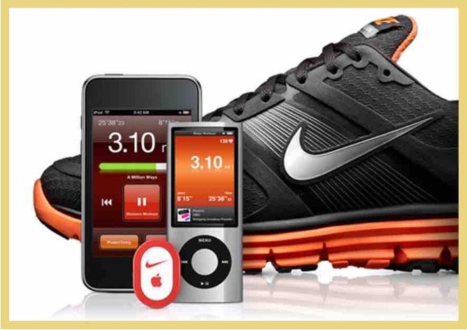
Nike + app and tracker
For longevity and for changing people’s lives, nothing beats Nike+. What started as a hack 15 years ago that allowed people to experience the brand promise of “Just Do It” without even owning the trainers has ballooned into the backbone of Nike’s offering.
It keeps improving, gives Nike a point of difference that can't be beaten, and is an incredibly clever piece of product/user experience design in one of the slickest interfaces going.
Sign up to Nike+ HERE
5) GravityLight – (Therefore, London)
Gravity Light using Newton's law of universal gravitation
This White and Black pencil-winning work is product design at its best. Before GravityLight, people without access to power (think refugee camps and slums, for example) would have had difficulty getting safe and reliable lighting.
GravityLight uses the power of gravity to pull a cord to charge a light. Enough to cook with or do homework by. Tons of copycat lights now, but this was revolutionary in 2014.
Case study HERE
6) Band in a Banner - Axion (Boondoggle, Belgium)
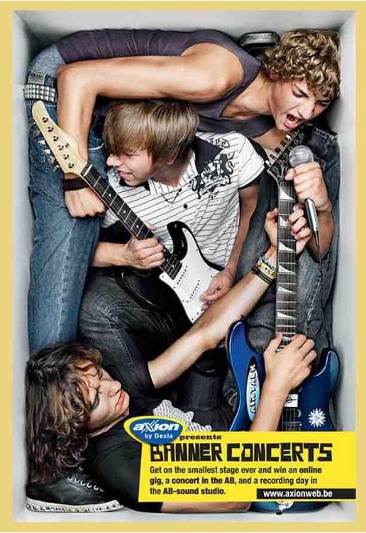
Banner Concerts Promo Poster
Belgian Bank Axion wanted to do more for students when they opened an account than hand out a free water bottle or sports bag, so at a time when the music industry was in chaos with Napster etc, they crammed popular Belgian bands into banners, literally.
Bands competed to win a recording session and a gig in one of Belgium’s biggest concert venues.
See the case study video HERE
7) Climate Name Change – 350 Action (Barton F. Graf, USA)
Hurricanes Renamed for climate action
A petition was raised to change the names of storms and hurricanes from Henk, Katrina, Sandy, etc, to those of politicians who denied climate change.
The launch video is genius; the petition was hugely popular and got millions talking about the issue.
See the case study HERE
8) Australian Lamb – The Generation Gap (The Monkeys, Australia)
The Generation Gap ad screenshot
Launching on Invasion Day every year (a bigger conversation not to have here), the Australian Lamb ads have been Australia’s answer to the Super Bowl.
Well, not quite, but they have become a viewing event akin to the John Lewis Christmas ads.
Some years have been better than others (this year’s is about the generation gap), but always about the power of lamb to bring the country together.
9) Orange RockCorps
Orange Mobile’s ‘Rock Corps’ posters
There was a time when telcos were super experimental with connecting to customers and building loyalty. Orange took it to the next level with RockCorps, where young people could exchange volunteer work for amazing gigs and experiences, doing good for communities and building obsession for Orange, the brand.
Now the telcos lack the distinctiveness they used to have, and it’s almost exclusively product advertising in the sector. Less playful, less experimental, lesser for it.
Not many promotional campaigns get their own Wikipedia entry. This one did. HERE.
10) Subservient Chicken - Burger King (Crispin Porter Bogusky, USA)
Screen shot from Subservient Chicken website
I remember where I was the first time I saw this beauty.
At a time when interactivity was primitive, and the world of streaming, social media and large file sizes were still years away, being able to tell a giant chicken man what to do as if on a webcam broke the young internet. It spawned many copycats, but the original is still the best.
See the case study HERE.


